If your mortgage website looks good but isn’t bringing in consistent leads, you’re not alone. Many loan officers and brokers invest in a website expecting results—only to find it quietly sitting there, doing very little.
The truth is simple: a mortgage website isn’t just about looking professional. It’s about earning trust quickly, guiding visitors clearly, and making it effortless to take action.
When you design your site with strategy instead of guesswork, your website becomes one of your most powerful lead-generation assets—working for you 24/7.
In this guide, we’ll break down exactly how to design a mortgage website that not only looks great but actually converts visitors into qualified leads.
Key Takeaways
- Your mortgage website must build trust within the first 5 seconds
- Clear messaging beats fancy design every time
- Mobile-first design is non-negotiable in today’s market
- Lead capture should feel helpful, not pushy
- SEO and conversion design must work together
Why Most Mortgage Websites Fail to Generate Leads
Let’s start with the hard truth.
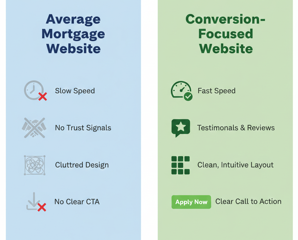
Most mortgage websites fail because they’re built like online brochures instead of conversion tools.
Here’s what usually goes wrong:
- The homepage talks too much about the company, not the borrower
- There’s no clear call-to-action above the fold
- Forms are long, intimidating, or poorly placed
- The site loads slowly or looks broken on mobile
- There’s no SEO strategy behind the content
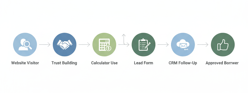
A high-performing mortgage website does the opposite. It guides visitors step by step, answers their questions, and makes them feel confident enough to reach out.
Design Mortgage Website With Clear Goals First
Before choosing colors, layouts, or features, you need clarity.
Ask yourself:
- Who is this website for? First-time buyers, refinancers, investors, or all three?
- What action do I want visitors to take?
- What questions are borrowers asking before they contact me?
When you design a mortgage website with one primary goal per page, everything becomes easier.
Examples of strong page goals:
- Homepage → Book a consultation
- Loan program page → Request eligibility review
- Blog article → Download a buyer guide
- Calculator page → Capture contact details for results
Clarity beats complexity every time.
First Impressions Matter More Than You Think
Studies show visitors form an opinion about your website in under 5 seconds.
That means your above-the-fold section must instantly communicate:
- Who you help
- What you offer
- Why you’re trustworthy
- What to do next
What a High-Converting Hero Section Includes
- A clear headline focused on the borrower
- A short supporting subheadline
- One primary call-to-action button
- Optional trust signals (reviews, licenses, years of experience)
Avoid vague headlines like:
“Welcome to Our Mortgage Company”
Instead, focus on outcomes:
“Helping Homebuyers Secure the Right Loan With Confidence”
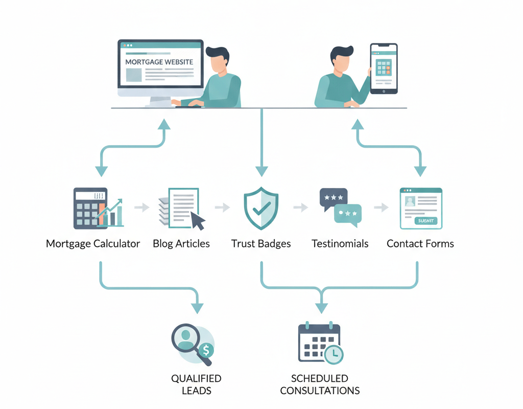
Want to simplify your mortgage journey?
Explore tools, calculators, and homebuyer content at GetMortgageWebsite.com.

Mobile-First Design Is Not Optional
More than 70% of mortgage website traffic comes from mobile devices. If your site isn’t designed mobile-first, you’re losing leads daily.
Mobile-optimized mortgage websites should:
- Load in under 3 seconds
- Use large, readable fonts
- Have click-to-call buttons
- Keep forms short and simple
- Avoid cluttered layouts
A mobile visitor should be able to request information in under 30 seconds—without zooming, scrolling endlessly, or getting frustrated.
Design Mortgage Website Pages That Build Trust Instantly
Mortgage decisions involve money, credit, and long-term commitment. Trust is everything.
Your website should visually and emotionally reinforce credibility.
Trust-Building Elements That Work
- Professional headshots and real bios
- Client testimonials with names and photos
- Licensing and compliance disclosures
- Secure SSL indicators
- Clear contact information
Avoid stock photos that feel generic or fake. Real people convert better—always.
Simple Navigation Leads to Better Conversions
If visitors can’t find what they need quickly, they leave.
Your navigation should be:
- Clean and uncluttered
- Limited to essential pages
- Organized by borrower intent
Recommended core navigation items:
- Home
- Loan Programs
- About
- Resources
- Reviews
- Contact
Drop-down menus are fine, but don’t overload them. Fewer choices lead to faster decisions.
Lead Capture That Feels Helpful, Not Pushy
Nobody likes aggressive popups or endless forms.
The best mortgage websites use value-driven lead capture.
Examples that work well:
- “Check Your Loan Options”
- “See What You Can Afford”
- “Get a Personalized Rate Review”
Best Practices for Mortgage Lead Forms
- Ask only essential questions
- Use multi-step forms instead of long ones
- Clearly explain what happens next
- Reassure users about privacy
Short forms convert better. You can always qualify leads later through follow-up.
Content That Educates and Converts
Content isn’t just for SEO—it’s for confidence.
When borrowers understand the process, they’re more likely to reach out.
High-converting content ideas include:
- Loan program explanations
- First-time buyer guides
- Refinance comparisons
- Mortgage calculators with explanations
- FAQ-style blog posts
Educational content positions you as an expert, not a salesperson.
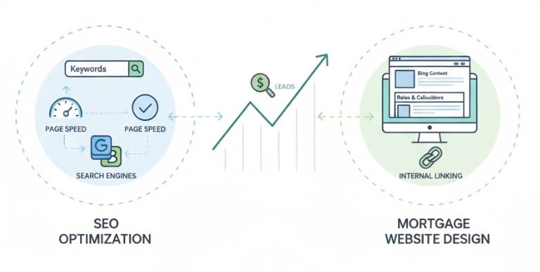
SEO and Design Must Work Together
A beautiful site that no one finds won’t generate leads.
Search-optimized mortgage websites focus on:
- Fast page speed
- Clear heading structure
- Keyword-focused content
- Internal linking between pages
- Location-based optimization
Use keywords naturally in headlines, body text, and image alt tags—but always prioritize readability.
Search engines reward websites that help users, not ones that stuff keywords.
Design Mortgage Website Pages That Guide Action
Every page should answer one question:
What should the visitor do next?
Effective CTAs include:
- Schedule a Call
- Get Pre-Qualified
- Request a Quote
- Download Guide
- Check Eligibility
Use buttons—not just text links—and make them visually stand out.
Consistency matters. Use the same CTA language across your site to avoid confusion. Mortgage decisions involve money, credit, and long-term commitment. Trust is everything.
Speed, Security, and Reliability Matter
Behind-the-scenes performance affects conversions more than you think.
Your mortgage website should include:
- Fast hosting
- Daily backups
- SSL security
- Regular updates
A slow or insecure site doesn’t just hurt SEO—it kills trust instantly.
Testing and Improving Over Time
Your website is not a one-time project.
The best-performing mortgage sites improve continuously by:
- Tracking form submissions
- Monitoring page bounce rates
- Testing CTA placement
- Updating content regularly
Small changes—like adjusting a headline or button color—can lead to noticeable improvements in lead volume.
Launch Your Mortgage Website Fast
Showcase reviews, capture leads, and grow your business all in one place.

Frequently Asked Questions
How long does it take to design a mortgage website that converts?
With the right framework, a professional mortgage website can be designed and launched within days—not months—especially when using proven layouts.
Do I need a CRM connected to my website?
While not required, CRM integration helps automate follow-ups and ensures no lead slips through the cracks.
How many pages should a mortgage website have?
Quality matters more than quantity. A strong site usually includes a homepage, loan program pages, an about page, a blog, reviews, and a contact page.
Is blogging really necessary for mortgage websites?
Yes. Blogging improves SEO, builds trust, and answers borrower questions before they contact you.
Can I update my website myself?
Most modern mortgage websites allow easy updates, so you don’t need to rely on a developer for every change.
Is my website data secure?
Quality mortgage website providers include SSL certificates, secure hosting, and daily backups as standard features. Always verify that your provider takes security seriously—it’s essential for protecting both your business and your clients’ information.
What pages should every mortgage site have?
Home, About, Loan Programs, Blog, Reviews, Contact, and a clear Apply or Book CTA.
Are these platforms suitable for teams?
Most mortgage website builders support multiple users, pipelines, and team workflows.
Conclusion
A well-designed mortgage website is no longer optional—it’s a core part of how borrowers decide who to trust. When you design a mortgage website with clarity, mobile usability, and borrower intent in mind, your site becomes more than an online brochure. It becomes a reliable lead-generation tool that works around the clock.
Focus on simplicity, trust, and guidance. Make it easy for visitors to understand their options and take the next step. When your website does that consistently, leads stop feeling unpredictable—and growth becomes sustainable.
Skip the Tech Headaches
We handle the website. You focus on loans.
🔒 Secure, backed up, and mortgage calculators


